


Introduction
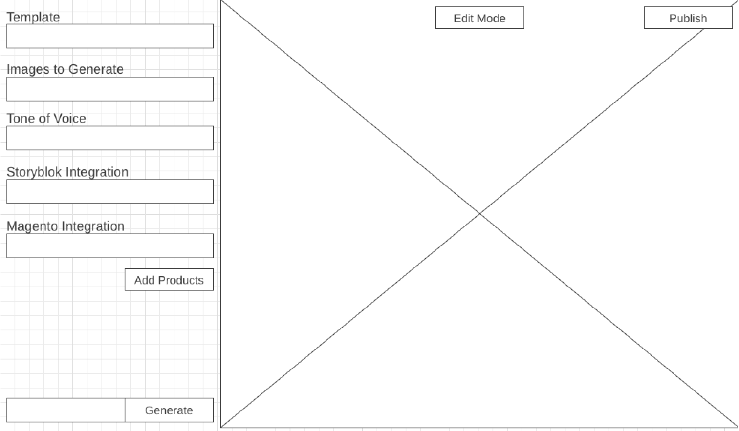
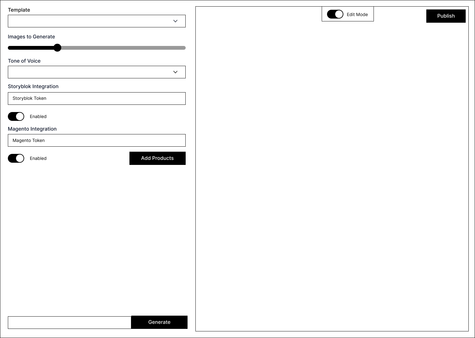
I realized that the tool might get more options in the future and this could make the space on the page really cramped. So I had to think of a better way to structure the page. My goal was to create a layout that could handle more options without feeling cluttered. I wanted to make sure more new features could easily be added while keeping everything organized. It was important to find a solution that would make it simple for users to navigate and use all the new options that might be added later on.
Abstract
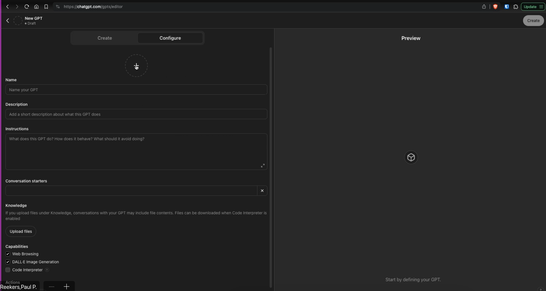
During one of the weekly update meetings, I had a discussion with my assessor about the current layout of our tool. He mentioned the layout that ChatGPT Plus users get which includes a lot of different options. Since ChatGPT is already using this layout it seemed like a strong choice for this too.
I brought up this idea with the stakeholders and they agreed that it would be better because it allows for more options to be added in the future. Another handy feature that this new layout allows for is a draggable sidebar. This would let users change the size of the page so they can see how it looks on different screens like phones. This feature would make the tool more flexible and user friendly.

Conclusion
With this new layout it would be possible to add more options without making the page look cluttered. The draggable sidebar is a helpful feature because it allows users to resize the page and see how it looks on different screens. This would make the tool more flexible and easier to use. Overall, the new layout would improve the usability and functionality of the tool and makes it ready for future updates and new features.